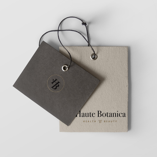


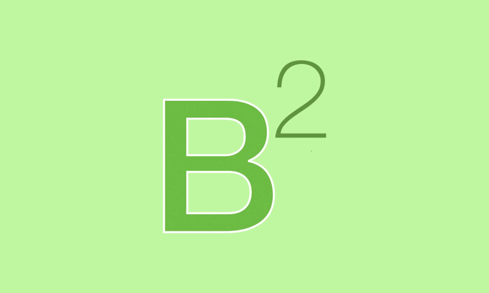
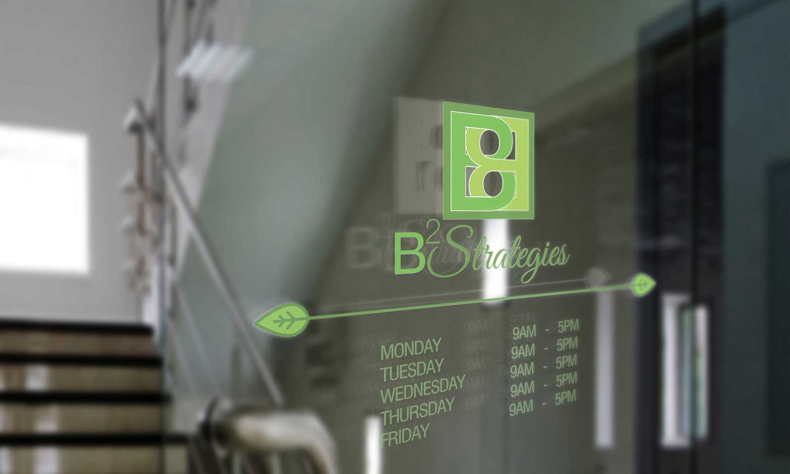
The firm needed an identity that emanates financial security and trust. The logo incorporates two letter B’s woven together to signify union and stability.
The firm needed an identity that emanates financial security and trust. The logo incorporates two letter B’s woven together to signify union and stability.
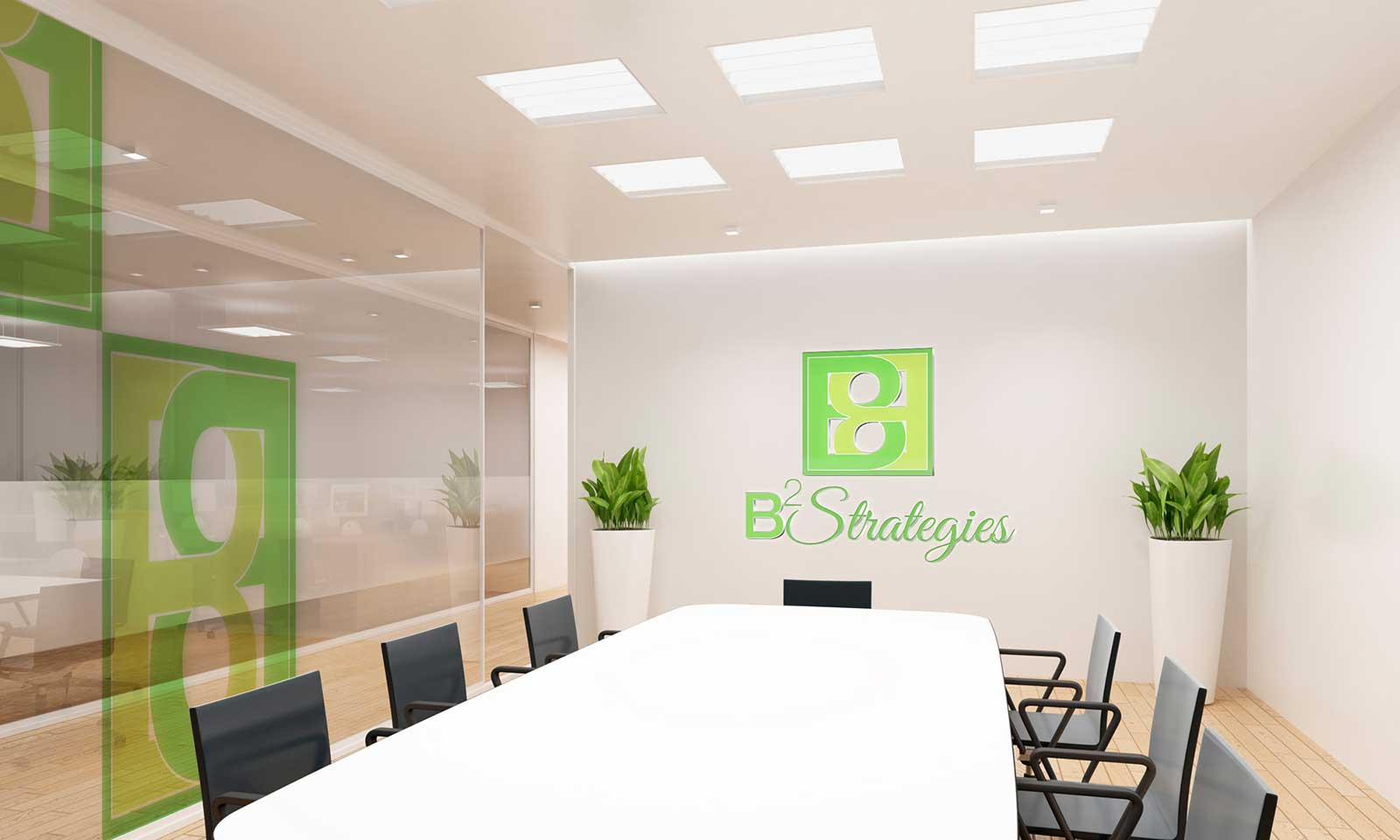
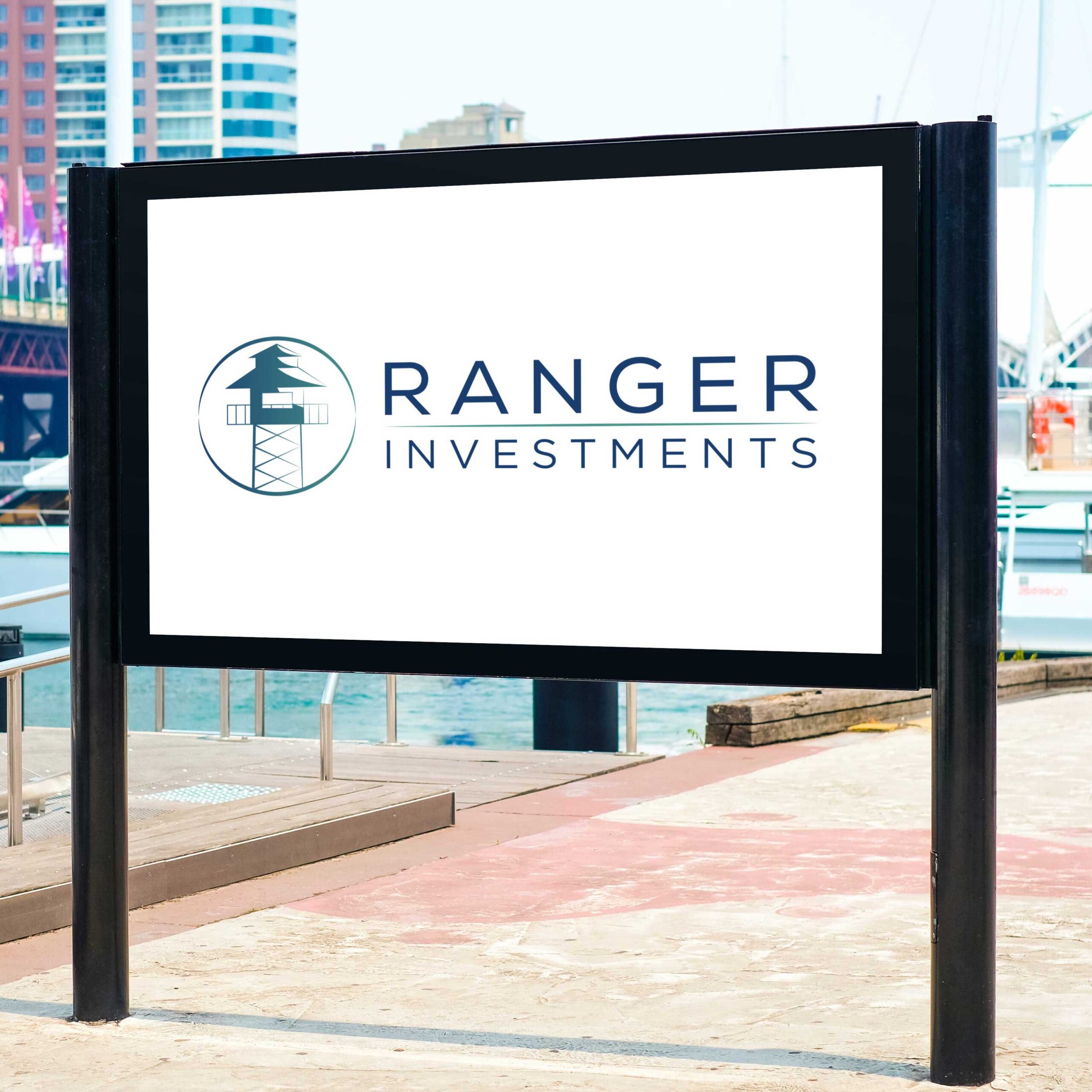
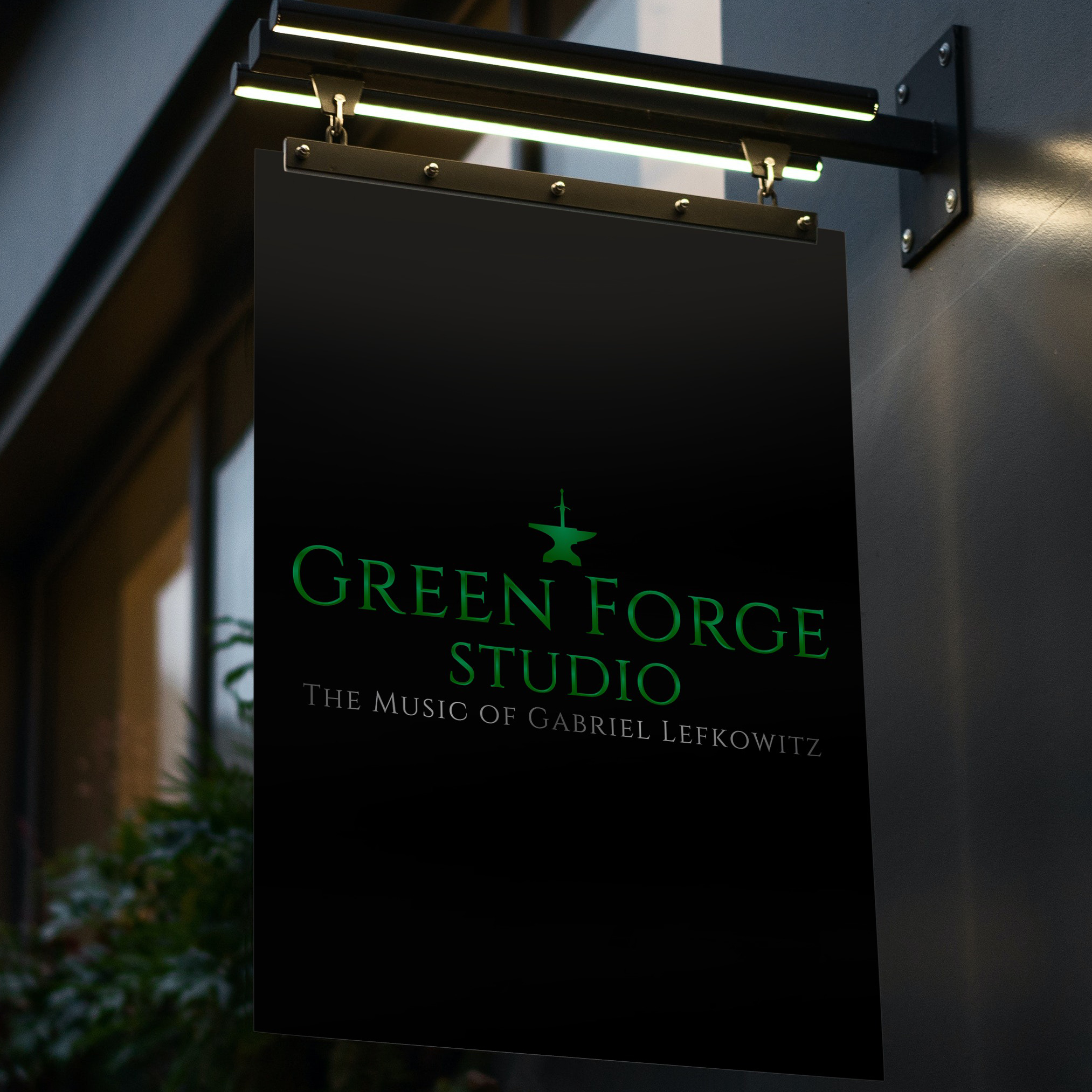
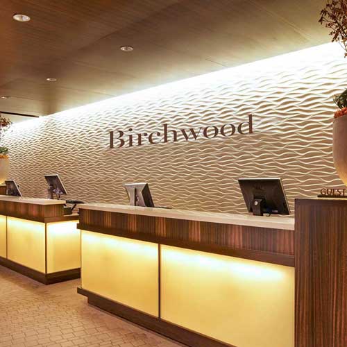
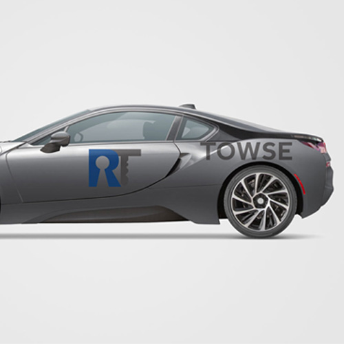
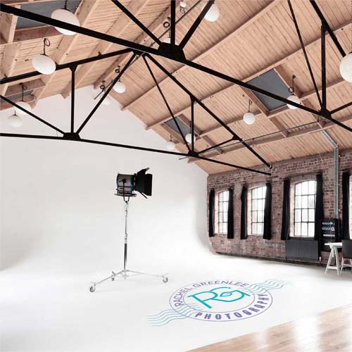
The logo is flexible and was designed to work on interior and exterior surfaces.
The logo is flexible and was designed to work on interior and exterior surfaces.

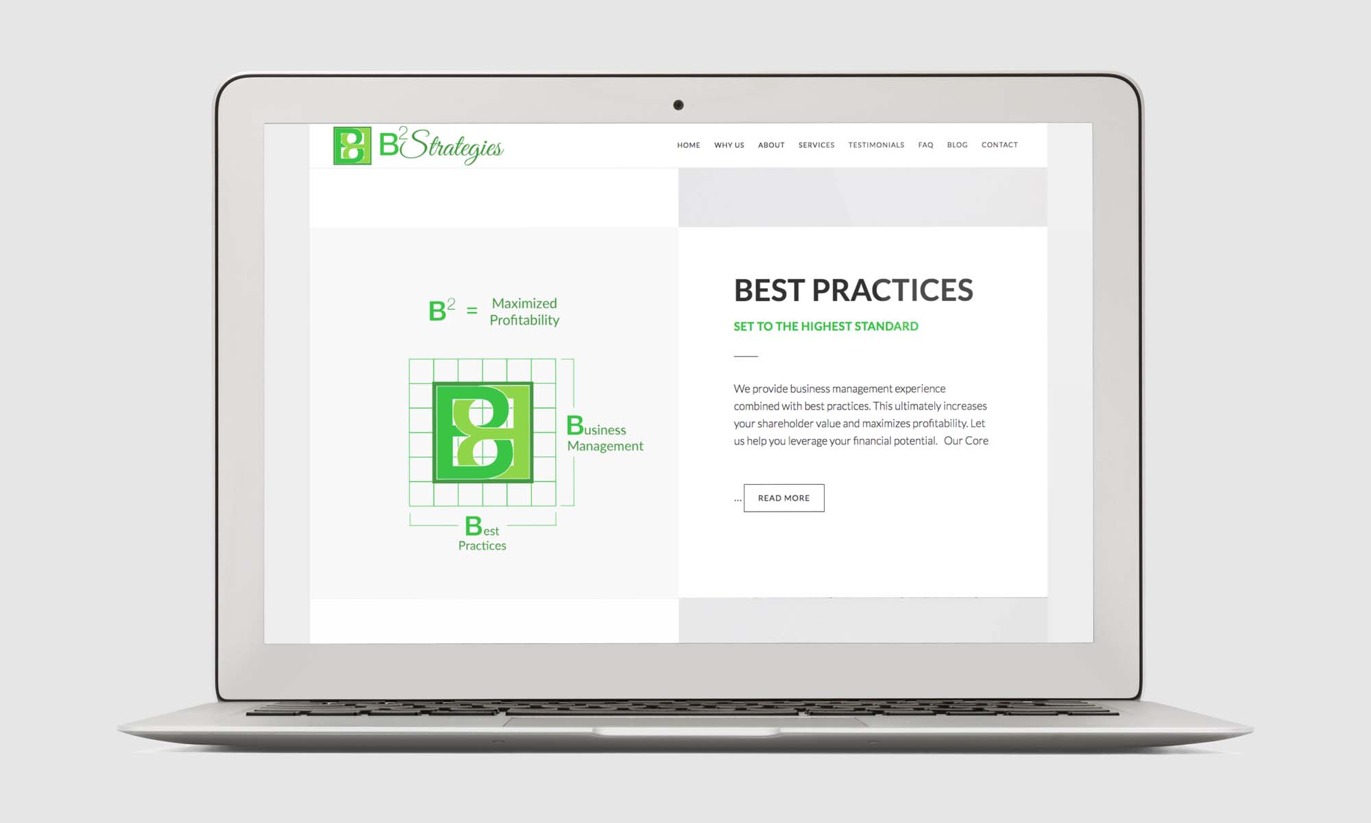
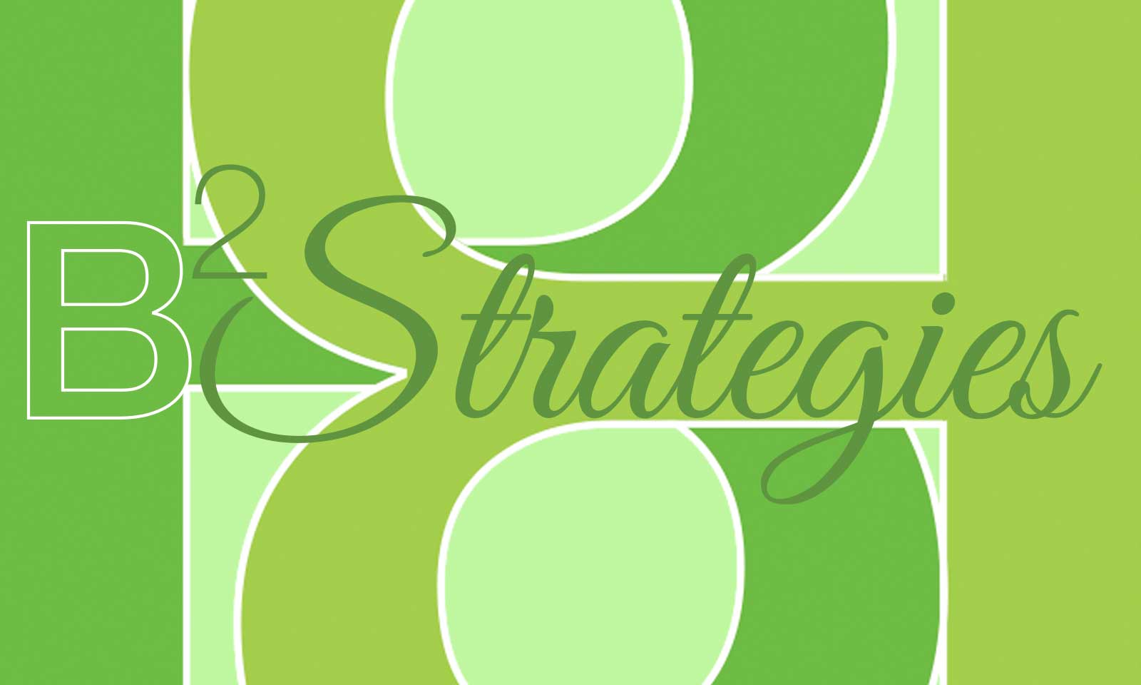
Lime green makes their identity pop and is congruent with the financial industry.
Lime green makes their identity pop and is congruent with the financial industry.

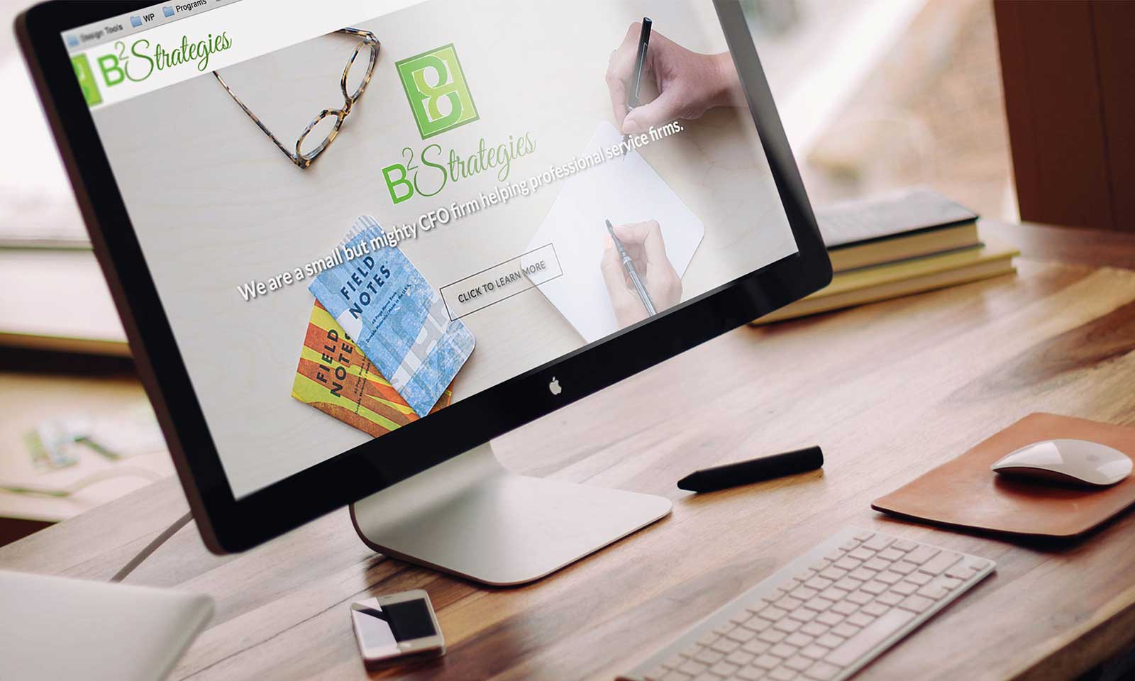
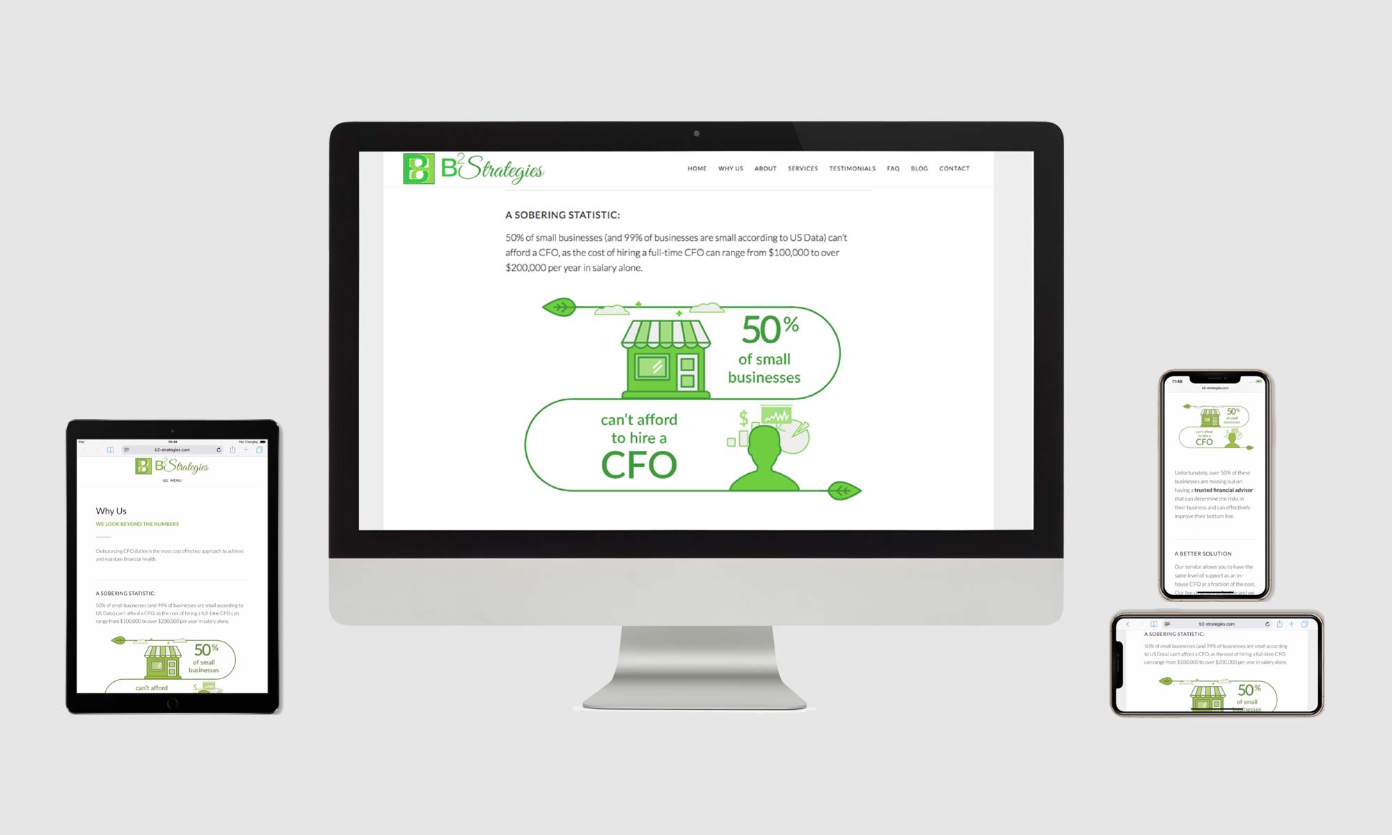
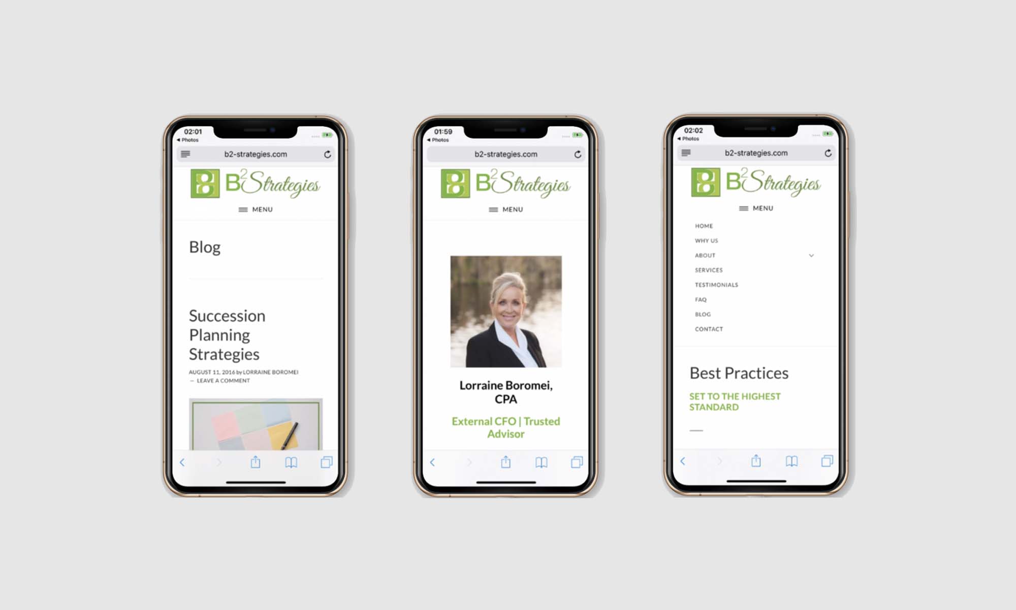
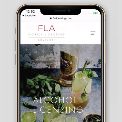
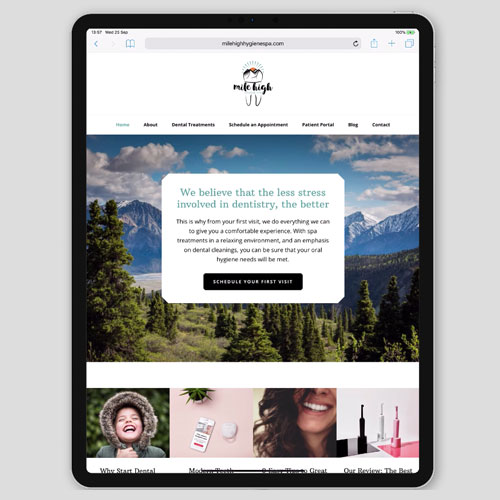
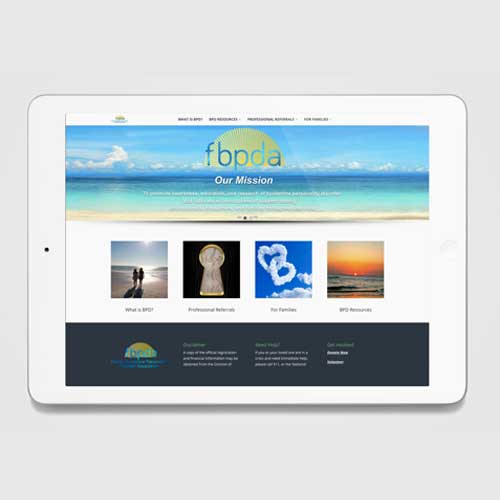
The responsive website is built on a wordpress platform.
The responsive website is built on a wordpress platform.