![Portfolio Logo Image](https://michellemarin.com/wp-content/uploads/2018/04/literary-agency-logo.jpg)
Candice Renae
Branding and logo design for a literary agency.
![Portfolio Logo Image](https://michellemarin.com/wp-content/uploads/2018/04/cards.jpg)
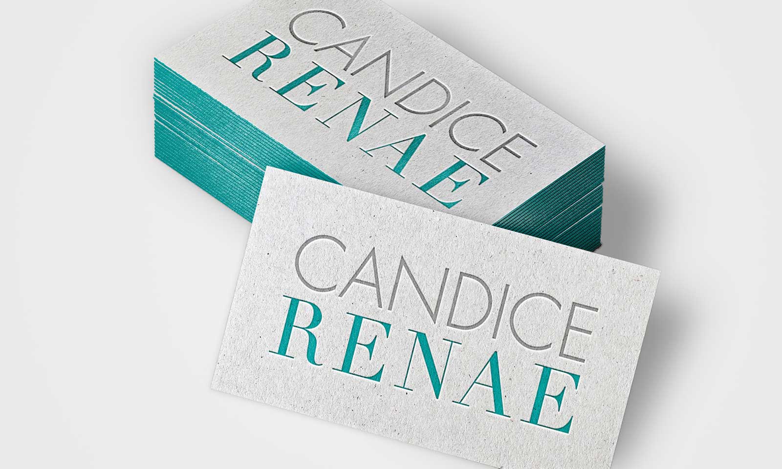
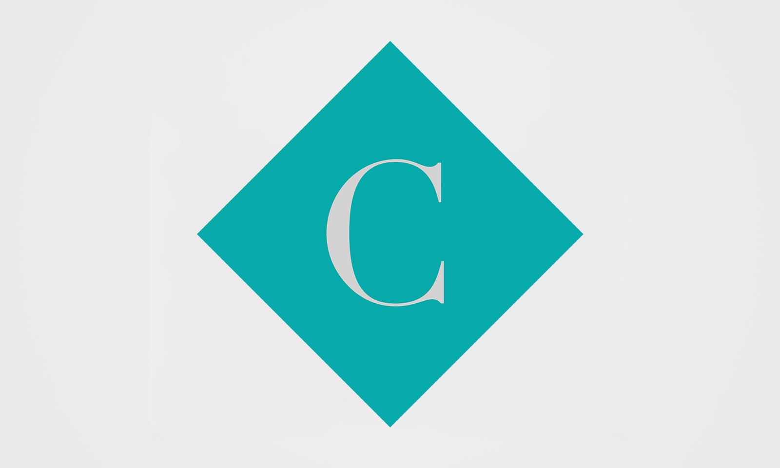
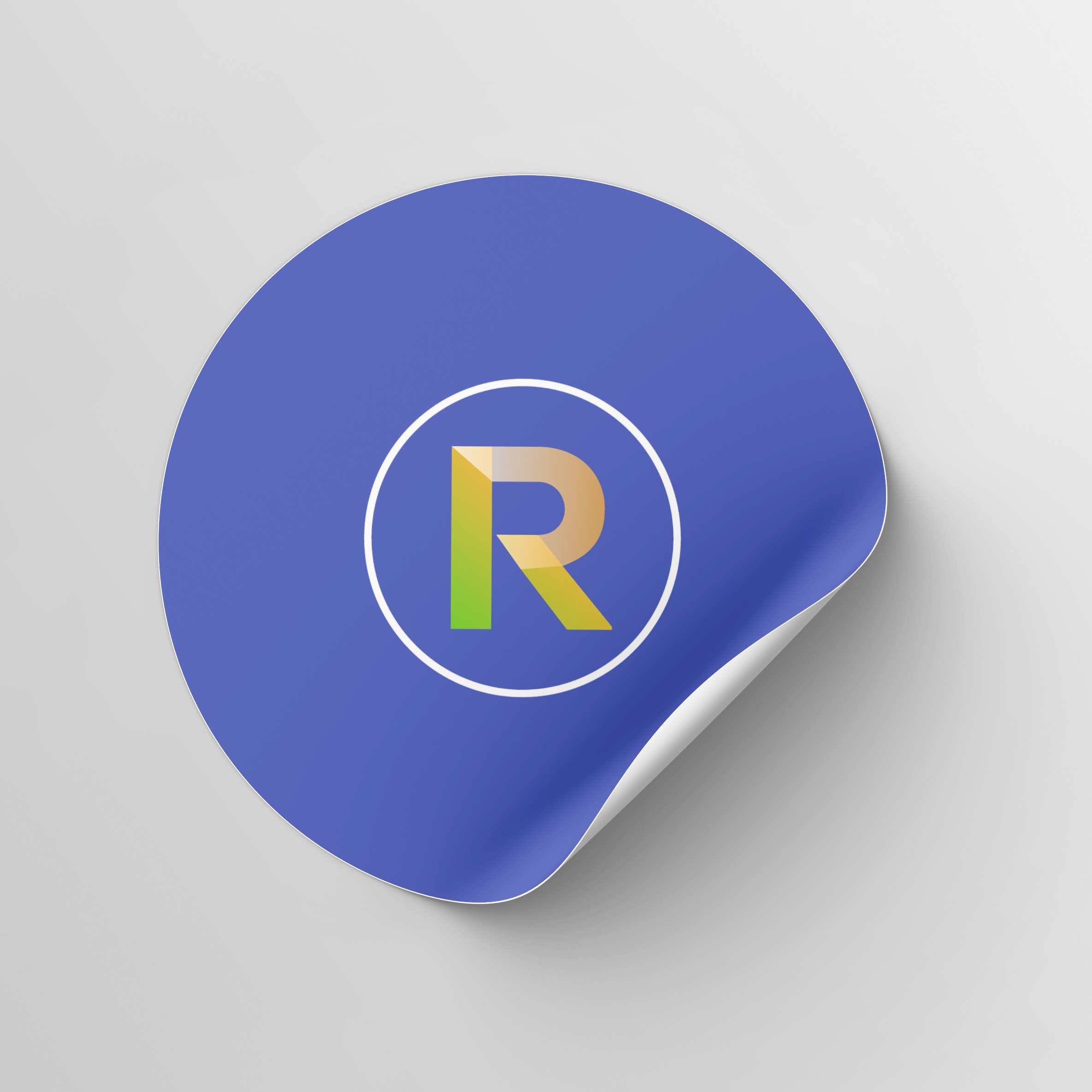
The agency wanted a brand identity that’s ultra clean and modern. Strong fonts were used with a minimalist background to accomplish the look.
![Portfolio Logo Image](https://michellemarin.com/wp-content/uploads/2018/04/publishing-agency-lgoo.jpg)
![Portfolio Logo Image](https://michellemarin.com/wp-content/uploads/2018/04/talent-agent-logo.jpg)
![Portfolio Logo Image](https://michellemarin.com/wp-content/uploads/2018/04/publsing-house-branding.jpg)
Diamond shaped icons with the company’s initial give the design character.
![Portfolio Logo Image](https://michellemarin.com/wp-content/uploads/2018/04/meeting-room.jpg)
![Portfolio Logo Image](https://michellemarin.com/wp-content/uploads/2018/04/literary-agency-branding.jpg)
Aqua blue and battleship grey balance masculine and feminine energies.
![Portfolio Logo Image](https://michellemarin.com/wp-content/uploads/2018/04/C.jpg)